Card Report HTML Templates in Oracle APEX allow you to define custom layouts for your Cards region using HTML with substitution strings. By creating a template, you can control exactly how each card renders—arranging titles, images, and text fields in any structure or style you choose. This flexibility lets you match your application’s branding and UX requirements, presenting data in a visually engaging format beyond the default card appearance.
To create a custom HTML template for a Cards region in Oracle APEX, you define exactly how each card renders by using substitution strings in your own markup. Here’s how:
1. Prepare Your Cards Region
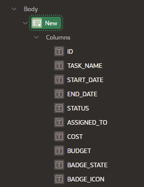
• In App Builder, open the page containing your Cards region or create a new Faceted Search or Cards report based on a SQL query that returns columns like TITLE, SUBTITLE, IMAGE_URL, DESCRIPTION, and ID.
2. Create or Clone a Card Template
• Go to Shared Components → Templates → Card Report Templates.
• Click Create or clone an existing template. Give it a name (e.g., “My Custom Card”).
• Set Type = Card Report.
3. Define the HTML Markup
• In the Template section, enter your card’s outer HTML. Use placeholders (#…#) for your query columns. For example:
<div class="card" style="width: 18rem; margin:10px;">
  <img src="#IMAGE_URL#" class="card-img-top" alt="#TITLE#">
  <div class="card-body">
    <h5 class="card-title">#TITLE#</h5>
    <h6 class="card-subtitle mb-2 text-muted">#SUBTITLE#</h6>
    <p class="card-text">#DESCRIPTION#</p>
    <a href="f?p=&APP_ID.:20:&SESSION.::NO::P20_ID:#ID#" class="btn btn-primary">View Details</a>
  </div>
</div>
• Common substitution strings include:
– #TITLE#, #SUBTITLE#, #DESCRIPTION# (your SQL aliases)
– #IMAGE_URL# for image columns
– #ID# for the key passed in links
– &APP_ID., &SESSION. for dynamic URLs
4. Assign Your Template to the Cards Region
• Back in Page Designer, select the Cards region.
• Under Appearance, set Template to “My Custom Card.”
• If needed, under Attributes → Card Columns, map your SQL columns to the region’s Title, Subtitle, Image, and Link settings so the placeholders resolve correctly.
5. Adjust Styling and Layout
• Use the Appearance section to set card grid classes (e.g., col-md-4) or a custom container.
• Add any required CSS in Inline CSS or a dedicated stylesheet to refine spacing, shadows, or hover effects.
6. Preview and Refine
• Run the page. Each record appears as a styled card using your HTML template.
• Hover over cards, test links, and tweak your markup or CSS until the cards look and behave as desired.
By defining your own Card Report HTML Template and mapping your data columns to substitution strings, you achieve full control over the look, layout, and behavior of each card in your Oracle APEX application.
Example
Certainly! In Oracle APEX, the Card Report is a powerful and visually appealing way to display data. The Card Report Body Advanced Formatting using HTML Expression allows you to customize how each card's body content appears, adding more flexibility for developers.
What is the Card Report?
A Card Report in Oracle APEX is a modern, flexible way to present data in a card-like layout. You can display rows of data in a grid of cards, and each card represents a data record. The body of the card is usually populated with data from a report query, but with advanced formatting, you can modify how the content appears using HTML expressions.
Objective:
You will learn how to use HTML Expressions to format the content of the Card Report Body in Oracle APEX.
Step-by-Step Tutorial
Step 1: Create a New Application
Open your Oracle APEX instance and create a new application.
Choose a Blank Application or any template you prefer.
Click Create.
Step 2: Create a Card Report Region
After the application is created, go to the App Builder.
Add a new Region by clicking on Create Region.
Choose the Card Report type from the list.
Choose the Source (typically a SQL Query or Table) for the report. Example SQL query:
SELECT
employee_id,
first_name,
last_name,
job_title,
department_name,
salary
FROM
employees
Step 3: Customize Card Body with HTML Expressions
To apply advanced formatting to the card body, follow these steps:
Navigate to the Card Body Section:
Go to the Card Region you just created.
In the Attributes tab, find the Card Body section. This is where you'll add your HTML expressions.
Using HTML Expressions:
In the Card Body area, you can use HTML and APEX substitution variables to format the content dynamically.
The general syntax for using substitution variables is &COLUMN_NAME. where COLUMN_NAME is the name of the column in your query.
Basic Example: Add an HTML expression to format the card body content with a simple greeting and the employee's information:
HTML Expression (example for Card Body):
<div class="card-content">
<h3>Hello, &FIRST_NAME. &LAST_NAME.</h3>
<p>Job Title: &JOB_TITLE.</p>
<p>Department: &DEPARTMENT_NAME.</p>
<p>Salary: $&SALARY.</p>
</div>
Explanation:
This example dynamically injects the employee's first name, last name, job title, department, and salary into the card body.
We use HTML tags like <div>, <h3>, and <p> to organize the content.
The &COLUMN_NAME. syntax will be replaced with actual data from the query for each row.
More Advanced Example: Add conditional formatting (e.g., salary-based color change):
<div class="card-content">
<h3>&FIRST_NAME. &LAST_NAME.</h3>
<p>Job Title: &JOB_TITLE.</p>
<p>Department: &DEPARTMENT_NAME.</p>
<p style="color: #FFF; background-color:
<% IF &SALARY. > 70000 THEN
'green';
ELSE
'red';
END IF; %>;">
Salary: $&SALARY.
</p>
</div>
Explanation:
Here, we use a conditional block (<% IF ... THEN ... END IF; %>) to check the salary.
If the salary is greater than $70,000, the background color of the salary will be green, otherwise, it will be red.
Step 4: Add CSS for Additional Styling
Sometimes, you might want to apply custom styles to your card body. This can be done via CSS.
In the Shared Components menu, go to CSS under Themes.
Add custom CSS to style the card report. For example:
.card-content h3 {
color: #2c3e50;
font-size: 18px;
}
.card-content p {
font-size: 14px;
color: #7f8c8d;
}
.card-content p.salary-high {
background-color: #27ae60;
}
.card-content p.salary-low {
background-color: #e74c3c;
}
In the HTML Expression part of your card body, apply custom classes:
<div class="card-content">
<h3>&FIRST_NAME. &LAST_NAME.</h3>
<p>Job Title: &JOB_TITLE.</p>
<p>Department: &DEPARTMENT_NAME.</p>
<p class="salary-high">Salary: $&SALARY.</p>
</div>
The salary-high class will style the salary as per your CSS.
Step 5: Preview and Fine-Tune
Run the Application by clicking on Run or Preview.
Test how the cards look and ensure that the data displays correctly in each card.
Refine the HTML expression to adjust any styling or layout issues.
Use Developer Tools (F12) in your browser to inspect elements and tweak styles further.
How do I Create a custom Card Report Template
Certainly! In Oracle APEX, a Card Report is a visually appealing and flexible way to present data in a card-like layout. Sometimes, the default card templates might not meet your exact needs, and in such cases, you can create and use a Custom Card Report Template.
Creating a custom Card Report template allows you to define how each card should look, and it can include custom HTML, CSS, and dynamic content. In this tutorial, I'll walk you through the steps to create a Custom Card Report Template and apply it to a Card Report.
Objective:
By the end of this tutorial, you'll know how to:
Create a Custom Card Report Template.
Apply it to your Card Report region.
Use dynamic content and custom styling within the template.
Step 1: Create a New Application and Card Report Region
Create a New Application:
Go to your Oracle APEX workspace.
Create a New Application (either Blank or another template).
Once your application is created, navigate to App Builder.
Create a Card Report Region:
Click Create Region.
Select Card Report from the region type.
Choose the data source for the report (e.g., a SQL Query or a table).
Example SQL query to pull employee data:
SELECT
employee_id,
first_name,
last_name,
job_title,
department_name,
salary,
hire_date
FROM
employees
Save the region and preview it.
Step 2: Create a Custom Card Report Template
To create a custom card template, follow these steps:
Navigate to Shared Components:
From the APEX App Builder, go to Shared Components (on the left panel).
Under User Interface, select Templates.
Create a New Template:
In the Templates section, click on Create.
Choose Card as the template type.
Define Template Settings:
Template Name: Give your template a name (e.g., Custom Card Template).
Template Type: Select Card.
In the Template Body section, you'll define the structure of each card using HTML.
Write the Template Code:
Below is an example of a custom card template that uses dynamic content for each card:
<div class="custom-card">
<div class="custom-card-header">
<h3 class="card-title">&FIRST_NAME. &LAST_NAME.</h3>
</div>
<div class="custom-card-body">
<p><strong>Job Title:</strong> &JOB_TITLE.</p>
<p><strong>Department:</strong> &DEPARTMENT_NAME.</p>
<p><strong>Salary:</strong> $&SALARY.</p>
<p><strong>Hire Date:</strong> &HIRE_DATE.</p>
</div>
<div class="custom-card-footer">
<button class="view-details-button" onclick="location.href='f?p=&APP_ID.:DETAILS:&SESSION.::NO::P1_EMPLOYEE_ID:&EMPLOYEE_ID.'">View Details</button>
</div>
</div>
Explanation:
&FIRST_NAME., &LAST_NAME., &JOB_TITLE., etc., are APEX substitution variables that will be replaced by data from the report query for each row.
The View Details button generates a dynamic link to view more details about the employee.
The structure of the card includes a header, body, and footer. You can style them accordingly.
CSS Styling (Optional):
To style your custom cards, you can either add inline styles directly in the template or use an external CSS file. Here's an example of inline CSS:
<style>
.custom-card {
border: 1px solid #ddd;
border-radius: 8px;
padding: 20px;
margin: 10px;
box-shadow: 0 4px 6px rgba(0,0,0,0.1);
}
.custom-card-header {
background-color: #f4f4f4;
padding: 10px;
text-align: center;
}
.custom-card-body {
padding: 15px;
}
.custom-card-footer {
text-align: center;
margin-top: 10px;
}
.view-details-button {
background-color: #4CAF50;
color: white;
padding: 10px 20px;
border: none;
border-radius: 5px;
cursor: pointer;
}
.view-details-button:hover {
background-color: #45a049;
}
</style>
Explanation:
This CSS will give the card a light shadow, a subtle header, and styled buttons. Feel free to modify the CSS to meet your design needs.
Save the Template.
Step 3: Apply the Custom Template to Your Card Report
Go to Your Card Region:
Navigate to the Card Report region you created earlier.
Modify the Region Attributes:
Under the Attributes tab for the Card Region, find the Template field.
Select the Custom Card Template you just created from the dropdown list.
Customize Region Settings (Optional):
You can further customize settings like the number of columns, pagination, and alignment of the cards in the region settings.
Save the Region and Run the Application.
Step 4: Test and Refine the Card Report
Preview the Application:
Click Run or Preview to see how your custom card layout looks.
Verify that each card displays the dynamic data correctly and that the styling appears as expected.
Inspect and Debug:
If needed, use your browser's Developer Tools (F12) to inspect the elements and troubleshoot any layout or styling issues.
You can adjust the CSS or template code as necessary.
Refining the Template:
If you need additional dynamic content, you can further enhance the template with more substitution variables or even JavaScript for interactivity.
Example: Adding an image or icon next to the employee’s name.
<div class="custom-card">
<div class="custom-card-header">
<img src="path/to/images/&PHOTO." alt="Employee Photo" class="employee-photo">
<h3 class="card-title">&FIRST_NAME. &LAST_NAME.</h3>
</div>
</div>


No comments:
Post a Comment